


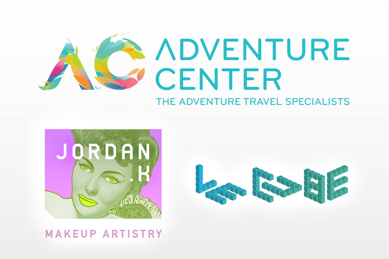
Adventure Center – 2011
Adventure Center, an North American travel agency specializing in exotic adventure travel. With this mark conveying the spirt of adventure travel, things you would see, touch and share was the focus. Colour was key in conveying the emotion with simple shapes used to represent birds, fish, leaves, plants, waves, clouds and mountain peaks.
Jordan K MUA – 2012
JORDAN.K Makeup Artistry finds its balance by contrasting consistency: typography, layout, and proportions, with more fluid and changeable background elements. Helping to convey the versatility of the brand, while keeping it open to reinvention over time. Unique typographic elements were designed to express individuality, structure, and professionalism. While illustrative elements and colours were created to evoke artistic skills, creativity, and an eye for style.
Le Cube – 2010
‘Le Cube’ is a plant container system that is comprised of smaller squares, rectangles and other Tetris like shapes that when all assembled form a single large cube. The brandmarks modular look goes beyond the basic square type to encompass the idea behind the project. Capturing the idea through it’s inter laid shapes and structure.